Minimal Watch Faces
- 3.3
- Rating
- 5.00M
- Installs
- Free
- Price
 Analysis by App-foxy
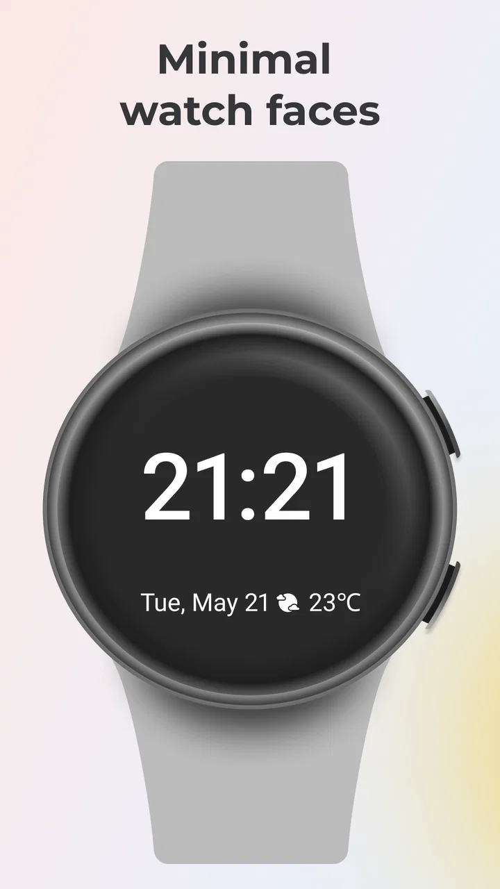
I spent time with Minimal Watch Faces as a personalization app for Wear OS, and my first impression was clear: it is aimed at people who want their smartwatch to look calmer rather than busier. The focus is not on turning the watch into a miniature dashboard packed with decoration. Instead, the appeal is a clean face that keeps the time easy to read while giving the wrist a more deliberate, understated appearance.
That sounds simple, but a watch face is something I see dozens of times each day. Small choices matter: whether the numbers are readable in a hurry, whether the layout feels distracting during work, and whether the design still looks appropriate when I am dressed formally. Minimal Watch Faces works best when I treat it as a practical visual layer for Wear OS, not as a complete smartwatch management tool.
A focused approach to Wear OS personalization
The app is developed by Battery Stats Saver and sits in the personalization category. It is free to install, with optional in-app purchases ranging from $0.99 to $99.99 per item. That pricing detail is worth keeping in mind before exploring everything available, because the free starting point makes it easy to test the general style, while some extras may require a purchase.
You May Also Like

 Blood Strike: 2.5 Anniversary
Blood Strike’s Loadouts Turn Every Drop Into a Tactical Gamble
A close look at Blood Strike’s custom loadouts: how fast access to signature weapons reshapes its battle royale rhythm, rewards preparation, and narrows the gap between fights.

 Pandora - Music & Podcasts
Pandora’s Music Is Easy to Start, but Harder to Recover
Pandora’s strength is its low-effort path from a seed to a station. Its weak spot is how much confidence it asks you to place in connection, setup, and quiet recovery.

 8 Ball Pool
 Is Built on Rivalries, Rematches, and Routine
A close look at the rivalries, rematches, shared routines, and unanswered safety questions that turn a quick pool match into a persistent mobile community.

 Samsung Music
’s Quiet Strength Is Playing What You Already Own
Its reach comes less from spectacle than from dependable access to a personal library. That simplicity is both the app’s strongest retention engine and its ceiling.

 AccuWeather: Weather Radar
AccuWeather Review: A Quick, Clear Forecast for Everyday Decisions
For everyday plans, the best forecast is the one you can understand quickly. AccuWeather makes rain timing, radar, and local conditions easy to act on, with a few trade-offs.

 Hill Climb Racing
Why Hill Climb Racing Still Turns Crashes Into One More Run
A tiny car, a bumpy hill and one more upgrade: Hill Climb Racing keeps resurfacing because its simple chaos makes every near-miss feel personal.
More From Our News Desk



The app has a 3.3 average from around 32 thousand ratings, alongside roughly 1.8 thousand written reviews. It has passed 5 million installs, so this is not an obscure experiment with no established audience. Those figures suggest that many people have at least tried it, although the middling average also tells me to approach it with realistic expectations rather than assuming every watch and every preference will be equally well served.
Minimal Watch Faces is suitable for Everyone, and it was released on February 3, 2020. The current version is 2.6.7. I find the version detail useful because watch-face apps depend heavily on the changing relationship between the phone companion, Wear OS, and the watch itself. Keeping the app updated is sensible, particularly if installation or synchronization becomes temperamental after a system update.
From a trust perspective, I would start with the same habit I use for any personalization app: read the permission prompts and the store’s privacy information before granting access. A watch-face application should not receive more access than its actual setup requires. I would also pay attention to whether the app presents clear choices during installation, especially around purchases or any optional account-related step. The visible controls matter more to me than a polished preview screen.
What the minimal style gets right
The strongest idea here is restraint. A minimal face can make the watch feel less like a noisy notification panel and more like a useful clock. When I am checking the time while walking, cooking, or moving between meetings, I do not want to decode a crowded arrangement of rings, icons, and tiny labels. A clean layout gives the main information priority.
This style is also a practical choice for people who change straps or clothing often. A restrained face usually clashes less with different colors and materials than a highly themed design. I can imagine using it with a casual silicone strap during the day and keeping the same general look with a metal or leather-style band in the evening. That consistency is one of the quieter benefits of choosing minimal personalization.
There is a trade-off, though. A simple face is only useful if its essential elements remain legible on the particular watch. Screen size, resolution, brightness, and the user’s eyesight all change the experience. A design that looks elegant in a preview may feel too delicate when viewed outdoors or during a quick glance. I would judge every face at arm’s length, in ordinary lighting, rather than choosing only from a screenshot.
How I would set it up for everyday use
My recommended workflow is to begin with one face that makes the time unmistakable. I would wear it for a full day before changing anything else. That exposes problems that a short preview hides: whether the hands blend into the background, whether the contrast is tiring, and whether the layout remains comfortable when the display dims.
After that, I would create a second choice for a different context rather than trying to force one design to do everything. For example, a quieter face can work well at the office or at night, while a stronger contrast option may be better for outdoor errands. The useful insight is that minimal does not have to mean identical. The goal is controlled information, not a single design used regardless of conditions.
I would also avoid changing faces repeatedly while troubleshooting. If a face fails to appear, I would first confirm that the watch is connected, check the phone and watch companion screens, and allow synchronization to finish before trying another design. Rapidly switching between several options can make it difficult to tell whether the issue is the selected face, the connection, or the installation process.
Another small but important habit is to check the watch after the face is applied, not just the phone preview. The watch is where readability, scaling, and the always-on appearance matter. If the face looks attractive on the phone but the time becomes hard to read on the wrist, I would remove it rather than rationalize the choice because the preview was appealing.
Trust, permissions, and moments that deserve attention
Because this is a personalization app, I would be especially careful at moments that are easy to rush through: the first launch, the request to connect with the watch, and any screen that leads toward optional purchases. I want each choice to be understandable. If a permission is presented, I would ask myself whether it is necessary for selecting or displaying a watch face. If the reason is unclear, I would pause instead of granting it automatically.
I would use the same caution when the app is installed on a phone that contains work information, family details, or sensitive notifications. A watch face itself may be visually simple, but the surrounding Wear OS environment can display personal content. I would review notification visibility on the watch separately and keep sensitive previews hidden if that is important to me. This is not a claim about the app’s data practices; it is a sensible boundary for the entire watch setup.
Purchases deserve similar attention. Since the app is free with optional items, I would check the purchase screen carefully before confirming anything and make sure the selected item is actually the style I want. On a shared device or a family payment account, I would enable the platform’s purchase protections and avoid leaving a child with unrestricted access to the purchase flow, even though the content rating is Everyone.
I also prefer apps that let me make decisions without feeling pushed into an account or subscription. When I use a watch-face catalog, I want to understand what I can try immediately, what is optional, and what will remain available if I later remove the app from my phone. Those are practical user-agency questions. I would inspect the visible settings and account controls rather than assuming that free installation means every part of the experience is free or independent of an account.
Who will appreciate it, and who should look elsewhere
I think Minimal Watch Faces is most suitable for someone who already owns a Wear OS watch and feels that the default faces are too busy, too colorful, or too tied to a particular brand style. It is also a reasonable choice for a person who wants a more neutral daily appearance without learning a complicated design system. If your main requirement is a clean time display with a few carefully chosen visual details, the app’s direction makes sense.
It may also suit someone who changes their watch face according to social setting. A restrained design can be less distracting during a presentation, more discreet in a quiet environment, and easier to pair with ordinary clothing. In that role, the app is less about showing off the watch and more about removing visual friction from it.
I would be less enthusiastic for users who want deep health tracking on the face, extensive complication support, animated themes, or a highly individual design assembled from many separate components. A minimal approach naturally gives up some information density. If you need to see several metrics instantly, a dedicated fitness-oriented face may be a better match than trying to make a sparse design carry too much information.
I would also hesitate to recommend it to someone who expects flawless compatibility without checking their exact Wear OS setup. Watch-face behavior can vary between devices and software versions. The sensible approach is to test one design first, confirm that it installs and behaves correctly, and only then consider paying for additional choices. That reduces the risk of spending money before knowing whether the app fits your watch.
How it compares with the usual alternatives
The obvious alternative is the set of faces already included with the watch. Those have one major advantage: they are usually the least complicated starting point and are closely tied to the device. If a default face already gives you the readability and calm appearance you want, Minimal Watch Faces may not add enough value to justify another app.
At the other end are highly configurable face builders. They can offer more control over colors, complications, layouts, and data fields. I would choose one of those when my priority is customization rather than simplicity. The cost of that flexibility is time: more settings to understand, more opportunities for clutter, and more decisions every time I want to change the look.
Minimal Watch Faces occupies the middle ground between those extremes. It is more focused than a general customization toolkit, but it gives users a route beyond the manufacturer’s defaults. That focus is its strength and its limitation. I would not install it expecting a full watch dashboard or a design laboratory. I would install it because I want a curated, quieter visual direction.
There is also a privacy-related comparison worth making. A built-in face generally involves fewer moving parts than a third-party catalog. With any external app, I would review the permissions, purchase prompts, and account choices before settling in. That does not automatically make the third-party option unsafe, but it does mean I should make an informed decision instead of treating personalization as consequence-free.
A realistic day-to-day scenario
Imagine checking the time during a busy morning while carrying groceries, answering messages, and trying not to stop in the middle of a sidewalk. A face with a strong, uncluttered time display can be genuinely helpful because it reduces the glance from a visual search into a quick confirmation. Later, at work, the same restrained design may feel more appropriate than a bright themed face that draws attention whenever the wrist moves.
In the evening, I might discover the opposite problem: a face that looked excellent indoors is less comfortable in dim conditions or when the watch enters its lower-power display state. That is why I would keep a second option ready and switch based on legibility, not novelty. The best personalization choice is often the one I stop noticing because it quietly does its job.
This scenario also shows why I would not judge the app solely by the number of available faces. Variety is useful only when the choices solve different problems. A small selection of readable designs is more valuable to me than a large catalog of near-identical options that all look good in a screenshot but behave similarly on the wrist.
My practical view of its limitations
The average rating of 3.3 is a reminder that the experience is not universally smooth. I would not interpret that number as proof of one specific fault, but I would take it as a reason to test carefully. Installation, synchronization, device compatibility, readability, and the difference between free and paid content can all affect whether the app feels worthwhile to an individual user.
The optional purchase range also means the free label should be read accurately: it describes the starting cost, not necessarily every available face or feature. Before buying, I would confirm what the item unlocks, whether it can be restored through the same platform account, and whether I am purchasing a design I can actually use on my watch. Those checks take little time and prevent avoidable disappointment.
Another limitation is inherent to the category. A watch face is visible constantly, so a minor annoyance becomes repetitive. Slightly weak contrast, an awkward placement, or a layout that hides an important detail can bother me more after several days than during the first five minutes. I would give any chosen face a proper trial and remove it promptly if it makes routine checks slower.
I would also keep expectations about data and controls grounded in what I can see. I would inspect the app’s permission screen, privacy information, and settings myself, and I would revoke access that is not needed. If the app offers account controls, I would use them deliberately; if a purchase screen appears, I would read it rather than tapping through. This approach gives me more control without making assumptions about practices that are not visible in the app.
My verdict after weighing the trade-offs
Minimal Watch Faces is a focused option for Wear OS owners who want their wrist to look cleaner and less distracting. I like the basic philosophy because it addresses a real everyday problem: many watch faces try to show everything, while I often need only a dependable time display and a calm visual design. The app’s large install base shows that the idea has reached plenty of users, but the average rating encourages a careful, device-specific trial.
I would recommend starting with the free experience, checking the face directly on the watch, and paying attention to readability in the places where you actually use it. I would review permissions and purchase prompts with the same care I give any third-party personalization tool. That combination of testing and caution is more useful than choosing a face solely because it looks polished in a store image.
My bottom line is simple: choose it for a quieter Wear OS appearance, not for maximum data density or unlimited design control. If that trade-off matches your habits, Minimal Watch Faces can make the watch feel more intentional and easier to glance at. If you need advanced complications, fitness information, or highly granular customization, the built-in options or a dedicated face builder will probably serve you better.
For me, the app is worth considering precisely because it stays narrow in purpose. I would keep it only if its faces make daily checks faster, its choices remain clear, and its controls feel comfortable to use. When those conditions are met, a minimal face is not merely decoration; it is a small improvement to how the watch fits into the day.
FAQs for Minimal Watch Faces
01What customization options are available in Minimal Watch Faces?
Minimal Watch Faces offers a range of customization features that allow users to personalize their watch face’s color, style, and layout. You can choose from different themes and tweak elements like font size and background images to suit your personal taste and make your smartwatch truly unique.
02Does Minimal Watch Faces drain battery quickly?
The app is designed with battery efficiency in mind. Minimal Watch Faces uses optimized graphics and processes to ensure minimal battery consumption. While using rich graphics may affect battery life slightly, the app balances aesthetics with performance to ensure a longer battery life.
03Is Minimal Watch Faces compatible with all smartwatches?
Minimal Watch Faces is compatible with most Android Wear OS and Apple Watch devices. However, it’s always recommended to check the app’s compatibility details on the download page to ensure it works seamlessly with your specific smartwatch model.
04Are there any in-app purchases in Minimal Watch Faces?
Yes, Minimal Watch Faces offers in-app purchases for premium themes and additional customization options. While the app provides a robust free version, users can opt for these purchases to unlock exclusive features and enhance their watch face experience.
05How often does Minimal Watch Faces receive updates?
The development team regularly updates Minimal Watch Faces to improve performance, introduce new features, and fix any bugs. Users can expect updates every few months, ensuring that the app remains fresh and compatible with the latest smartwatch technology.
Pros
- Sleek
- modern design options.
- Highly customizable interface.
- Battery-efficient performance.
- Easy to navigate settings.
- Compatible with most devices.
Cons
- Limited free features available.
- In-app purchases can be pricey.
- Occasional lag on older devices.
- Some designs lack uniqueness.
- No offline mode available.

Minimal Watch Faces
Gallery